This is Part 4 of a series of articles on knowledge structures. Below are links to the other articles in the series.
Part 1: An introduction to the concept of knowledge structures
Part 2: Using the knowledge organisation hierarchy
Part 3: Understanding book structures with content structure maps
Summary

What is an argument structure map?
An argument structure map provides a visual depiction of the structure of an argument.
While providing the ‘big picture’ explanation of the elements of an argument, they also need to be accompanied by text that elaborates on the category and topic titles shown on the map and that provides the detail and nuance necessary for reader understanding.
Argument structure maps are normally diagrams, which can be defined as the visual representation of individual elements and their relationships in a two-dimensional space. However they can also incorporate illustrations.
Their scope can vary from covering individual points, a significant part of a book or an entire book.
The benefits of argument structure maps
Arguments are often complex. Extended chains of reasoning, nested hierarchies and feedback loops often make it hard for readers to understand, let alone fully engage with, an author’s argument. This problem is exacerbated when different elements of an argument are distributed throughout a long book.
Being able to see a diagram that shows all the components of an argument, as well as the relationships between these components, provides clarity for readers. A diagram also allows them to relate the detail they are reading to the bigger whole.
Examples of argument structure maps
Here are five examples of effective argument structure maps.
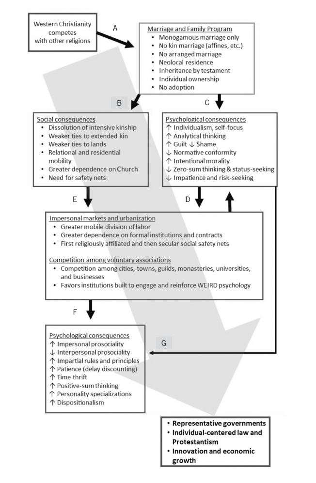
1 . The Weirdest People in the World
Joseph Henrich, the Ruth Moore Professor of Biological Anthropology at Harvard University, has produced one of the best examples of an argument structure map I have come across. It can be found in his book The Weirdest People in the World: How the West Became Psychologically Peculiar and Particularly Prosperous (Penguin, 2021).
In the concluding chapter of his book, The Dark Matter of History, he includes the diagram below, which summarises a key part of his argument. Henrich manages to compress the essence of a complex argument into an easy to comprehend diagram so that even people who haven’t read the book will be able to understand the gist of his argument. His use of examples in the bullet points on a subsidiary level also allows him to add in a lot more detail without making the overall progression he is describing overly complex to the reader.

An alternative approach the author might have taken would have been to add the diagram to the beginning of Part II so that readers were initially given an overall schema which they could draw on to put the detail they encounter into a wider context.
2. The Shortest History of Europe
In his book The Shortest History of Europe (Old Street Publishing, 2012), John Hirst makes an extended argument about the key changes in European ideas and belief over 1,300 years from the fall of the Roman Empire in about 476AD to the Romantic Movement in the 18th and 19th centuries. (I think the Shortest History series includes some of the most interesting diagrams I’ve come across. I’ve used three from the series in this article.)
The argument structure map he has provided allow readers to view the key points of his argument and how they relate to each other in a few seconds. And the diagram gives a framework which readers can refer back too as they read the 41 pages of text which Hirst needs to fully explain his argument.

His argument becomes much more understandable and memorable because of the clarity of his diagram.
For example, Hirst’s explanation below discussing a divide in European culture that remains powerful to this day becomes clearer for readers as they look at the diagram to see the opposing arrows at the bottom along with the three key elements at the top:
“The twin forces of science and progress on the one hand and emotion and liberation on the other are still very strong. Sometimes they can reinforce each other; sometimes they are opposed to each other …
It is our fate to be torn, divided and confused. Other civilisations have a single tradition and not this odd threesome. They are not so liable to the turmoil, overturnings and confusion that we have had in our moral and intellectual life.” (p.43 and 45)
3. The Shortest History of Germany
While the first two argument structure maps relate to significant parts of their books, James Hawes, in his The Shortest History of Germany book (Old Street Publishing, 2018), uses simple diagrams to illustrate individual points he is making in the text.
His simple sequence diagram below brilliantly explains his argument about changes to the recipients of German tax income in the last 150 years.

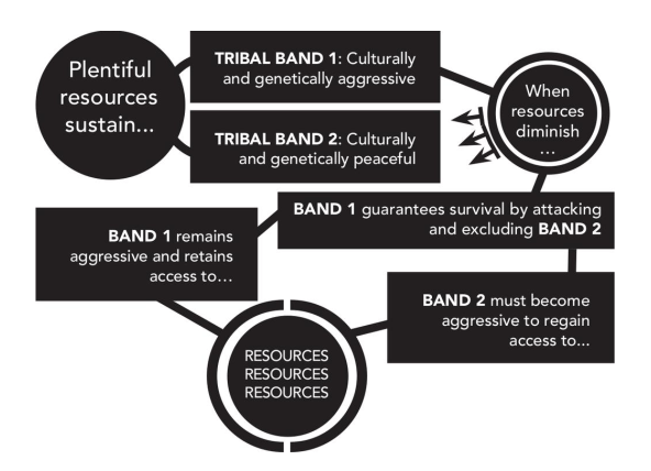
4. The Shortest History of War
My fourth example comes from The Shortest History of War by Gwynne Dyer (Old Street Publishing, 2022).
The diagram brilliantly illustrates Dyer’s argument about the impact of a reduction in available resources on bands in early societies and how limited resources forced peaceful bands to become more aggressive in order to survive.
The diagram enables the choice forced on Band 2 by diminishing resources to be understood clearly and simply.

5. The causal landscapes concept
Causal landscape diagrams are argument structure maps that focus on causes and effects.
The concept has been developed by Gary Klein, a US research psychologist well-known for his work in the field of decision-making. He wanted to escape from the common tendency to provide overly simple explanations for the causes of events and also to push against the idea that the eventual outcomes of events were inevitable.
In his article on why Hilary Clinton lost the 2016 US Presidential Election, he writes that
“most of the accounts I have read zero in on a single cause for Clinton’s defeat, which is a tendency Robert Hoffman and I encountered in our research on what constitutes an acceptable causal explanation. People like to have everything boiled down to a single cause, which almost always is a great oversimplification.”
The core of a causal landscape is a diagram that shows all the different causes grouped into higher-level categories. This allows readers to see at a glance the multiplicity of different causes for a specific event.
Below is his causal landscape of Hilary Clinton’s 2016 US Presidential Election loss.

The second stage of a causal landscape involves working out which of the most important causes would have been easiest to change with the implication that changes could have affected the outcome of an event.
In the diagram below, Klein identifies four causes that, if they had been approached differently, could have led the election to go Clinton’s way:
- alienation of lower class whites
- excessive focus on Trump negatives
- taking three swing states for granted
- the ‘basket of deplorables’ comment.
The visual highlighting of the four causes allows a much greater focus on them than could be done with text alone.

Why argument structure maps work
There are many reasons why argument structure maps work.
1. They demand less cognitive work from the reader.
I like to look at levels of cognitive work through the lens of computational efficiency. This concept is discussed in the neglected 1987 paper ‘Why a Diagram is (Sometimes) Worth Ten Thousand Words’ written by cognitive scientist Jill Larkin and economics Nobel prize winner Herbert Simon.1
The concept of computational efficiency is based on the following principles:
1. To make a communication computationally efficient is to minimise the amount of unnecessary cognitive effort demanded from the learner. To be computationally efficient also means that the level of cognitive effort demanded from the learner falls within their available resources.
2. Different ways of communicating the same information (such as written text or diagrams) demand different levels of cognitive effort from learners.
Diagrams work because using the spatial arrangement of elements and their relationships to convey meaning speeds up information processing enormously. The human visual system is able just to “read off” the meaning. This is in contrast to text as its linear nature means that learners have to sequentially construct their own understanding of how the different elements of an argument relate to each other as they go through the content. That means that diagrams are often more computationally efficient than text at conveying the big picture.
However, diagrams tend to focus more on category titles, topic titles and summary points. That doesn’t work so well for conveying nuance and detail, which is when paragraphs of text come into their own.
3. Authors should aim to minimise the amount of wasted cognitive effort of their readers by making diagrams in general, and argument structure maps in particular, a more common feature of non-fiction books.
I have written more about the concept of computational efficiency here.
2. They provide all the elements of an argument in one place.
When the elements of an argument are distributed over the length of a book, it can be hard for the reader to combine all the different elements of an argument and the relationships between them into a unified whole. Having an argument structure map ensures that the reader is presented with a unified and coherent whole.
The analogy of a jigsaw is relevant here. No one would dream of starting on a jigsaw without having a picture of the completed jigsaw to work from. Similarly, I think many readers benefit from having a big picture of an argument in the form of an argument structure map that they can use as a framework to understand how all the detail of an argument fits together.
3. They make the content of arguments easier to remember.
Argument structure maps make arguments much easier to remember. I would be able to explain to someone else the arguments contained in the diagrams above in a much more satisfactory way than many of the arguments I’ve read in non-fiction books that don’t provide an argument structure map.
4. They show the shape of arguments.
What I find fascinating about all the diagrams above is that they each have their own individual shape, which readers don’t necessarily pick up just from reading a textual description. And I think understanding the shape of the argument helps readers better understand the meaning and nuance of each of the arguments being made in the diagrams.
For example, John Hirst’s argument about the conflicts in European culture is brought home in a very concrete way as the opposing forces of emotion, culture, nationalism and liberation on the one hand and reason, science and progress on the other are shown in the diagram with arrows pointing in opposite directions.
5. They provide clarity for the reader.
All the diagrams above are crystal clear. Readers can see at a glance all the components of the argument as well as the relationships between the components. That’s helpful not just for readers trying to understanding a new argument but also makes it easier for them to critique that argument.
6. They demand clarity from the author.
Authors who create argument structure maps are forced to be explicitly clear in a way that is often lacking when the argument just exists in the format of written text.
Conclusion
The benefits that argument structure maps bring – communicating the big picture more efficiently, making the content of arguments easier to remember, providing clarity for the reader and enforcing clarity on the author – all point to the fact that argument structure maps deserve to appear in many more non-fiction books.
If you are currently writing a non-fiction book – or a long blog post or article – and would like to explore how you might develop and use argument structure maps, please get in touch.
Argument structure maps for skills and capabilities
All the argument structure maps above focus on declarative knowledge (ie. knowledge about the world). However I increasingly feel that many books and courses that teach procedural knowledge (ie. skills and capabilities) would benefit from using argument structure maps too. The teaching of skills and capabilities is often underpinned by arguments (and accompanying assumptions) about efficacy and procedures that are implicit.
Making these arguments explicit would provide more clarity for the learner and would encourage some teachers to tighten up their thinking.
Notes
- Larkin, J.H. and Simon, H.A. (1987), Why a Diagram is (Sometimes) Worth Ten Thousand Words. Cognitive Science, 11: 65-100. https://doi.org/10.1111/j.1551-6708.1987.tb00863.x [↩]

