


This article originally appeared in Charlotte Crowther‘s newsletter for course creators. While the article is focused on using diagrams in teaching courses, the principles it discusses are also relevant to writers of non-fiction books and other longform text.
Visual summary

The need to reduce unnecessary cognitive effort
Learning new knowledge and skills as an adult is always demanding. Materials have to be consumed and understood. New ideas have to be practised and applied.
And all this has to be done in the context of busy lives, competing demands on one’s time and overloaded attention spans.
All course creators know the frustration of having learners who don’t progress far enough through a course to reap its benefits. Often learners start with high excitement but then their motivation diminishes as the course progresses.
This can be put down to various reasons. However one key factor is demanding excessive cognitive effort from your learners.
Of course effort is necessary in all learning. However, a key goal in designing courses should be to reduce the expenditure of unnecessary effort so that learners don’t get overwhelmed by excessively demanding course materials.
Courses should be designed so that learners can use their cognitive energy for activities that will further their learning – rather than having to wrestle with too much complexity and a lack of clarity.
One of the best tools for understanding how to do this is the concept of computational efficiency.
Computational efficiency
The concept of computational efficiency is discussed in a neglected 1987 paper written by a cognitive scientist and a Nobel prize winner in economics.
The paper is called ‘Why a Diagram is (Sometimes) Worth Ten Thousand Words’ and the authors are cognitive scientist Jill Larkin and Nobel laureate Herbert Simon.1
The concept of computational efficiency is based on the following principles:
1. To make a communication computationally efficient is to minimise the amount of unnecessary cognitive effort demanded from the learner. To be computationally efficient also means that the level of cognitive effort required from the learner falls within their available resources.
2. Different modes of communicating the same information (such as written text or diagrams) demand different levels of cognitive effort from learners.
3. All other things being equal, one should aim to minimise the levels of wasted cognitive effort by choosing the most computationally efficient communication mode.
4. In many instances, diagrams are more computationally efficient than text.2
While the Larkin and Simon paper only focuses on written text, the drawbacks the authors identify for text can equally be applied to the spoken word, such as the video lessons widely used by course creators.
What makes diagrams computationally efficient?
All knowledge has structure. Each description, concept, idea or argument is made up of different knowledge elements which are deliberately structured in a way that will best express the meaning that the teacher is intending to communicate. Making sense of any knowledge requires understanding the structure of the explanation — and how learners do this depends on the communication mode being used.
The linear nature of both the spoken and written word means that learners have to sequentially construct their own understanding of how the different elements of an explanation relate to each other as they go through the content. This can often be quite cognitively demanding.
The nature of a diagram, which can be defined as the visual representation of individual elements and their relationships in a two-dimensional plane, allows understanding to happen in a different way.

In diagrams, meaning is communicated through the use of:
- category titles
- different types of container shapes
- connectors (eg. lines, arrows, words, arithmetical symbols)
- positioning (intersection, adjacency, proximity/distance, nesting)
- changes in attributes (colour, shading, container size, font size and weight).
Using the spatial arrangement of elements and their relationships to convey meaning speeds up information processing enormously because it allows the human visual system to “read off” the meaning.
So, for example:
1. An arrow can instantaneously show a cause and effect relationship or the progression of time.

2. Nesting a shape within another one or showing elements on different levels instantly indicates a hierarchical relationship.

3. One can establish the relative importance of elements by looking at container size, font size or the weight of the font.

The ability to quickly infer meaning from the spatial arrangement of objects often requires significantly less cognitive effort than the work needed to construct meaning from the written or spoken word.
This means that learners can devote more of their energy to other key learning tasks such as integration with existing knowledge, reflection, practice and implementation.
How diagrams help with different aspects of learning
Different aspects of learning involve different cognitive operations — or, to put it another way, different computational operations.
In their paper, Larkin and Simon focused just on using diagrams to solve physics, mathematics and economics problems and looked at how diagrams help with three of the key cognitive operations needed to problem-solve effectively:
- search (being able to find the information you require)
- recognition (which can also be understood as comprehension)
- inference (being able to draw conclusions from the information presented).
The cognitive operations that course creators require from their learners will depend on the type of knowledge or skills they are teaching but tend to be more extensive than those needed for problem-solving. They will normally include some or most of the following operations:
- preview
- comprehension
- memorisation and recall
- review
- practice and application
- search
- relating the parts to the whole.
Learners can benefit from having diagrams to help them with each of these processes.
Preview
Giving your learners a diagram of the learning journey you are going to take them on gives them a top-level overview of all the detail they are going to have to grapple with.
Comprehension
The fundamental benefit for comprehension is that diagrams provide an explicit structured outline that helps learners be clear about the important ideas they need to focus on and how they fit together.
Memorisation and recall
Diagrams can act as conceptual objects that make abstract ideas more concrete for your learners and therefore easier to grasp. It requires less effort to memorise and recall the key elements of a concept or a process when communicated in a diagram rather than a series of paragraphs.
Review
Once learners have gone through a course, they often want to refresh their memory about the key ideas they have come across. When summaries are missing, learners either have to go through much of the detail again or decide to give up. Including diagrams in the summary makes reviewing the material a much more productive process.
Practice and application
Practice and application often include a structured process. Providing this in the form of a diagram makes it easier for learners to follow and then internalise the process.
Search
Often learners need a particular piece of information once they’ve completed a course but struggle to work out which module they can find it in. A detailed diagram of the content makes that much easier.
Relating the parts to the whole
When you’re in the midst of a course, it can be hard to work out how what you’re reading or watching fits into the bigger whole. Diagrams can show the relationship of the parts to the whole very effectively.
In addition to these direct benefits that diagrams bring, there is also an important second-order benefit.
What may seem clear and comprehensive when you write something down can turn out to be unclear when you have to spell out the exact relationships between ideas in a diagram. The process of creating a diagram imposes a discipline of clarity and precision that writing on its own doesn’t necessarily provide. And then once you have this enhanced understanding, you can use it to tighten up your writing.
Making the content of your course clearer and more precise for your learners will make it easier for them as they try to understand, practice and implement your course.
Where text fits in
It’s important to realise that diagrams and text aren’t competing alternatives but instead complementary tools to be used where they are most effective. That is why Larkin and Simon included the word ‘sometimes’ in the title of their paper, ‘Why a Diagram is (Sometimes) Worth Ten Thousand Words’.
As we have seen, diagrams are fantastic for identifying key topics and their underlying structure. Text on the other hand is best at communicating detail and nuance — and for telling stories.
Using diagrams in practice
There are three types of diagrams that can be particularly useful for course creators:
- visual framework/process diagram
- content structure map
- learning process diagram.
Visual framework/process diagram
A visual framework (or process diagram) is something that all course creators should create if they don’t have one already. Having a diagrammatic representation of the process you want your learners to follow will make it easier for them to understand and put it into practice.
The diagram below of Charlotte Crowther’s MySnapshot Process is a good example of this, showing the overall structure and shape of her process as well as the different components of each stage.
While some visual frameworks are professionally designed, this diagram proves they don’t have to be. The key thing is to provide a visual framework for your learners and the lack of professional input shouldn’t put you off creating one.

Content structure map
A content structure map provides an overview of the content of a course. This type of diagram can have several functions:
- it can provide a road map describing how the content of a course is structured
- by showing all the content in one place, it can make what’s got to be learnt seem more manageable
- if a learner is searching for a particular piece of information, the map can show exactly where the content can be found
- it allows learners to easily see how individual parts of the course relate to the course as a whole.
Content structure maps can provide different levels of detail. For Gwyn Wansbrough’s Breakthrough Facilitation course, she provides a top-level diagram showing the main areas being covered.

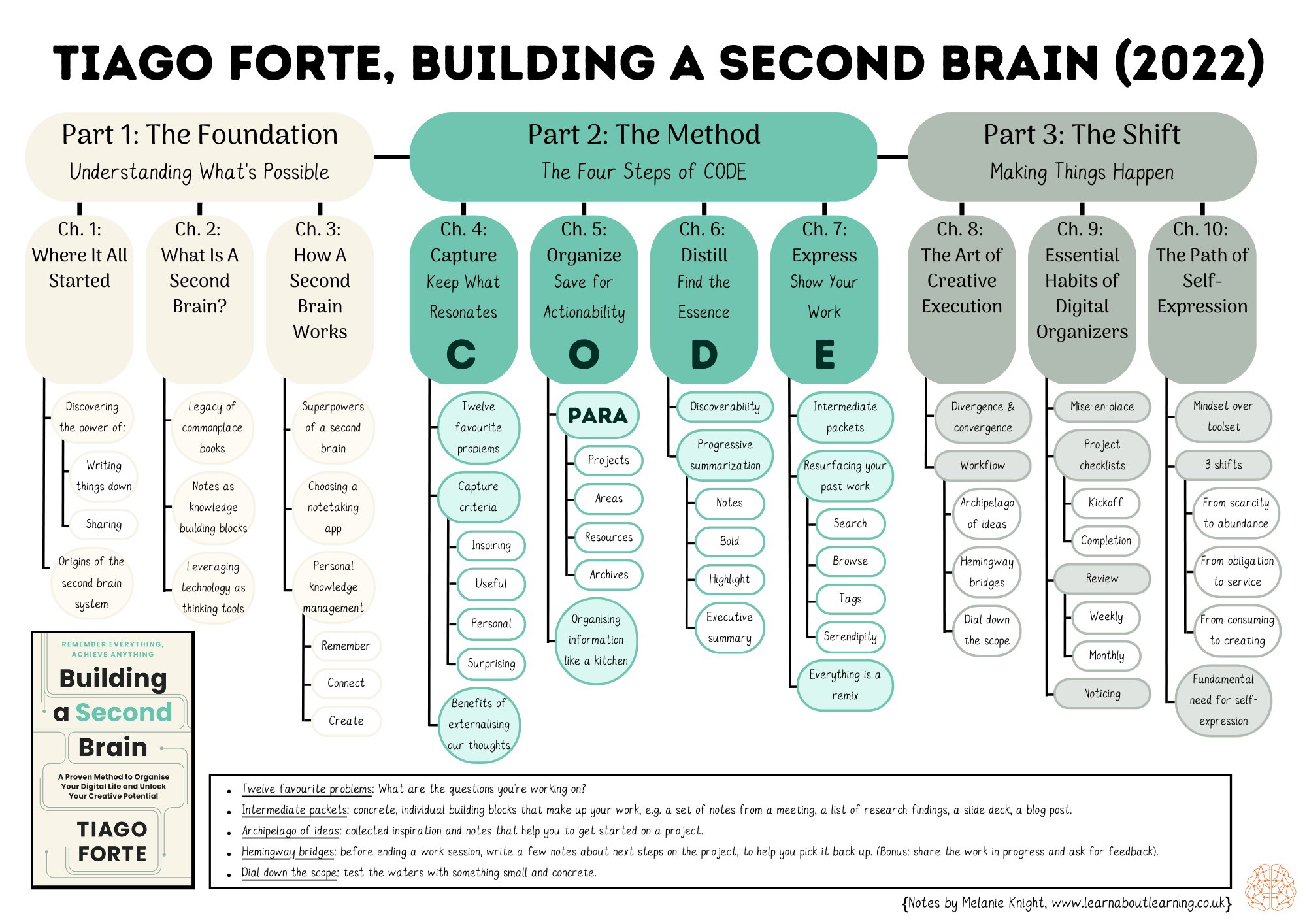
However, it’s possible to provide a lot more detail too! The content structure map describing Tiago Forte’s book’s Building a Second Brain, developed by instructional designer Melanie Knight, provides two extra levels of detail.
Learning process diagram
One key type of diagram that is missing from many courses is a learning process diagram. This depicts the process learners need to take in order to move from their current lack of knowledge and skills through to achieving the results they want.
The actual learning process learners need to take is often not discussed in great detail by course creators. There are two key benefits of creating such a diagram:
- It will sharpen up your thinking about the educational journey you are taking your learners on and help you identify any gaps or lack of clarity in your process.
- It will make it clearer for your learners exactly what they need to do to develop the knowledge and expertise they desire.
The content of a learning process diagram will vary from course to course. Below is a diagram Charlotte Crowther gave to one-to-one clients in her former Learn To Be Well wellbeing and performance program explaining the process she would be taking them through.

The limits of computational efficiency in diagrams
Of course there are various circumstances which reduce the computational efficiency of diagrams.
One of the commonest examples is having an overly complex diagram which overwhelms the processing capacity of the learner.
A famous example of this is a causal loop diagram which analysed the US’s counter-insurgency strategy in Afghanistan in 2009.

The sheer complexity of the diagram was widely criticised and General Stanley McChrystal, the US and NATO commander in Afghanistan at the time, was said to have remarked: “When we understand that slide, we’ll have won the war!”.
Adding levels
There’s a simple solution to excessive complexity: creating multiple diagrams over two or three levels of detail.
At the top level you show how the most important topics are related — and then on lower levels you go into more detail for each topic. The key idea is that each diagram is easy to understand on its own but that they are also all linked. This enables learners to either move down a level to find out more detail or move up a level to establish the wider context.
Marisha Mets of SLP Now®, a membership for speech-language pathologists, has done exactly this.
The top-level diagram for the SLP Now® Academy shows the three main pillars of her program.

Then she provides more detailed diagrams for each of these pillars.
Powerful Practice pillar diagram

Streamlined Systems pillar diagram

Intentional Growth pillar diagram

Course navigation structure
Marisha also incorporates this two-level process structure into the course navigation structure in her Academy. This reinforces her members’ awareness of the course structure and gives them clarity about how the parts of the membership fit into the whole.

Conclusion
Computational efficiency is an important concept for all course creators to learn about and practice. If you want to maximise the results your learners want to achieve, it’s important to add diagrams to your course content to increase its computational efficiency.
Notes
- Larkin, J.H. and Simon, H.A. (1987), Why a Diagram is (Sometimes) Worth Ten Thousand Words. Cognitive Science, 11: 65-100. https://doi.org/10.1111/j.1551-6708.1987.tb00863.x [↩]
- Strictly speaking Larkin and Simon are contrasting sentential text (ie. text organised into sentences and paragraphs) with diagrams since, of course, diagrams include text in the form of category titles and brief descriptions of relationships. For the sake of ease, I am using ‘text’ to stand for ‘sentential text’ in this article.
Their focus on using diagrams to help solve physics, mathematics and economics problems means that they cover only a limited number of diagrammatic types, such as illustrative diagrams, schematic diagrams and graphs.
Subsequent authors have extended the analysis of diagrams to show how the spatial location of elements can efficiently convey conceptual meaning using the concept of the ‘visual argument’.
This approach is more relevant to the needs of course creators and is the one I have used in this article.
The initial discussion of the visual argument concept came in a 1981 paper from R. Waller, which now seems to be completely unavailable (Waller, R., Understanding network diagrams. Paper presented at the annual conference of the American Educational Research Association, Los Angeles, April 1981).
However Waller’s ideas are discussed in the following two papers:
Daniel H. Robinson, Gregory Schraw, Computational Efficiency through Visual Argument: Do Graphic Organizers Communicate Relations in Text Too Effectively?, Contemporary Educational Psychology, Volume 19, Issue 4, 1994, 399-415. https://doi.org/10.1006/ceps.1994.1029.
Vekiri, I. What Is the Value of Graphical Displays in Learning?. Educational Psychology Review 14, 261–312 (2002). https://doi.org/10.1023/A:1016064429161. [↩]